Lots of companies struggling to increase Conversion Rates. On average, a typical landing page converts at a rate of about two percent. To put it in perspective, if you have a website with 100 visitors, that means only one will convert to an actual lead or customer.
Working with a landing page conversion rate is something that many new companies or entrepreneurs look at as being too hard to tackle. The problem is, when you don’t have the proper knowledge then it can be difficult to make sure that your efforts are paying off in terms of increased lead generation. Fortunately, there are ways for you to optimize those results without having to stress out about trying to come up with an original strategy.
So how can you get your conversion rates up? The short answer is: by doing more of what works and less of what doesn’t work. Here are some suggestions for design elements that have been proven to increase landing page conversion rates:
- Understand your campaign goals
- Understand your audience
- Understand what your customers want from you
- Use a clear and concise headline
- An attractive layout
- Good use of color on the page
- Photos as opposed to just words and illustrations
- Frequent use of subheads
- Highlight the Key Values
- Avoid Long-Form Content
- Provide a strong call-to-action button with offers
- Include testimonials from happy customers
- Optimize your form fields
- Make your landing page more personal
- Include an Explainer Videos
- Display Trust Badges & Guarantees
- Offer incentives to motivate prospects to convert
- Create a sense of urgency
- Include a photo of people using your product or service
- Include Social Media Icons
- Include an FAQ Section
- Use a live chat module
- Test Multiple versions of landing page
I have uploaded several screenshot from various real world websites for educational perpose. I am not promoting any brand, product or company.
Learn Details to Increase Conversion Rates
Understand your campaign goals
The first step in landing page optimization is to understand what you’re trying to do with your campaign. For example, if the goal of a landing page is to drive leads for an upcoming webinar, it should focus on building anticipation and provide information about that event’s speakers and agenda. But if the desired outcome was more immediate – such as generating sales for a specific product or service – then urgency needs to be communicated from the start.
a) Understand your audience
Every successful marketing strategy starts with understanding who you’re targeting (your customer avatar) so that content can speak directly to them at all times. Make sure that everything happening on any given landing page corresponds precisely with this demographic: their interests, their pain points, etcetera.
b) Understand what your customers want from you
If a customer’s goal is to find out about product specifications or pricing, make sure that information is readily available on the page in an unobtrusive way – don’t force them to hunt for it. If they’re more interested in learning how their purchase will improve their life, then testimonials and case studies can be used effectively as well. Again, just remember: every part of the landing page should speak towards its intended purpose.
Use a clear and concise headline
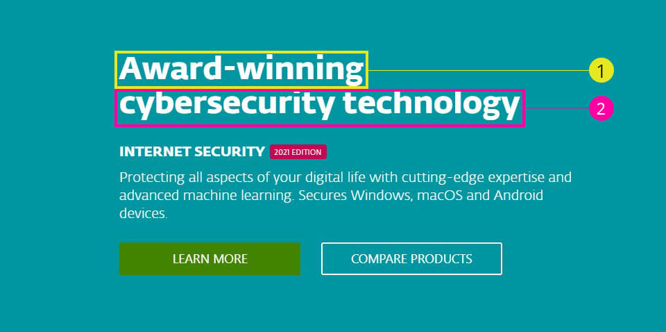
A good headline is the first thing that your visitors will see, and it may be all they read before deciding to either stay on the page or move on. Keep in mind what you’re trying to convey with this particular landing page: are you inviting them for a free test drive? Are you previewing an upcoming event? Do they need more information about your services or products?
The point is this: there’s no one-size-fits-all approach when it comes to headlines. So make sure yours accurately reflects where people can expect to find content relevant to their needs after reading just a few words.
Design An attractive layout
The layout of your landing page can make or break its conversion rates. So take the time to create a design that’s beautiful and also easy for visitors to navigate through, with clear navigational elements at the top right corner (or wherever you prefer) – this type of clean organization will help alleviate any confusion in regards to what they should do next on your site if they click into a specific section.
Include plenty of white space so that images don’t feel crowded, but be sure not to go overboard: studies have shown that when it comes down to deciding which content is most important on their screen, people are more likely to focus on items located in an area without much competition from other distracting distractions nearby. This makes sense since our attention span is only so long, but it’s also why you should use this information to make sure that your most important items are located in an area with less competition.
a) Good use of color on the page
Color has been found to have a huge impact on mood and even conversion rates when used correctly. For example, bright colors often give people feelings of happiness while dark colors may generate more anxiety or sadness; conversely, cool shades can imply calmness whereas warmer tones like orange signify excitement. If you want visitors to feel excited, then avoid using blue all together because studies show that it gives people feelings of depression! Instead opt for reds, oranges – colors associated with passion and urgency.
b) Photos as opposed to just words and numbers
Again, the goal is to make your visitors feel something. If you’re using a photo of people smiling and enjoying themselves on your landing page then they’ll likely start feeling happy too – which will, in turn, lead them to feel more confident about coming onto your website or giving out their contact information (to learn more!). But don’t forget: if the desired outcome was for them to buy something right away, then photos should be used sparingly so as not to distract from other important items that need attention like an “Add To Cart” button.
c) Frequent use of subheads
To break up content into bite-size pieces without disrupting its flow, include headings throughout any given long-form article; this will help keep readers engaged and will also give them a chance to stop reading without losing their place. Without subheads, readers could easily get distracted by the fact that they’ve reached the bottom of one page before finishing an entire thought; this means your important information is at risk of being overlooked – which defeats the whole purpose of writing in long-form content!
For these reasons, make sure you use good heading styles throughout any given article: H tags, headings set large enough so as not to be missed on mobile browsers (14pt), etc.
The point here is if people know where they are within your landing page then there’s less confusion when it comes time to click over somewhere else on the site or convert into a lead. Make sure navigation elements are well-labeled and easy to find, with links that are clearly labeled to prevent any confusion.
Highlight the Key Values

One of the most important things to do on your landing page is highlighting its Key Values.
This might be a great price or how it’s more affordable than other options – whichever one applies to you as an individual company! You should also mention what makes this product, service, etc., different from others so that visitors have all the facts and can make their decision based on them rather than just going with “whatever” because there are tons of choices out there.
You want to help people see why they should choose your solution over another option; if not then we don’t know whether you’re planning on doing something else in order to create sales (such as starting a new marketing campaign). If someone doesn’t understand the value behind your product or service, then they’re not likely to buy – no matter how great it is.
This section should be at the top of your landing page because people are going to look here first; so put this as close to the top as possible and make sure it’s visible in any browser!
Avoid Long-Form Content
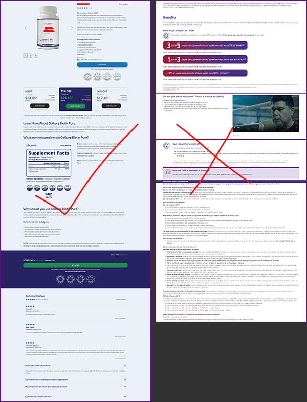
Landing page content should be customized to engage users. Actually, it is essential to create landing pages that provide real value to potential customers and not just empty sales pitches.
The landing page should offer something of value for potential customers, but it also should be as short as possible. It has been found out that long copy tends to decrease the conversion rate by up to 50%.
However, if you want your target audience to notice and take interest in the content posted on your landing page it’s advisable not only to avoid too much text and info-graphics but also to make sure that the information found on it is relevant and easily readable. Or you can simply use hyperlinks to your blog post about the details on that specific topic.
Provide a strong call-to-action button with offers
CTAs (calls to action) are the most important element of a landing page because they are what will ultimately lead to conversions. These CTAs can be in a variety of shapes and sizes but the most important aspect is that you make sure it’s big, bright, and stands out (so visitors don’t miss it!). So if your goal is for visitors to fill out their contact information then make sure there’s an easy-to-find “Contact Us” button somewhere on your page; conversely, if you want them to sign up for more info or download something from your site then place this CTA prominently near the top of your landing page with its own eye-popping color so as not to get lost behind other content.
Call to action that stands out from the rest of the content with eye-popping color (make it big!)
Offer only one offer at a time, no more than two offers per landing page; make sure CTAs are prominent on-site pages, near top or bottom depending on the goal.
Include testimonials from happy customers

This is a great way to show visitors who are considering whether or not they want to purchase from the company that other people have already had success with you. Just remember: don’t post anything about this customer unless it’s something positive because social proof works only when it makes others feel good and confident in making their decision – which will naturally lead them back into the arms of your business!
Include testimonials, make sure they’re positive ones so as not to discourage customers from coming onto the site or converting.
Optimize your form fields
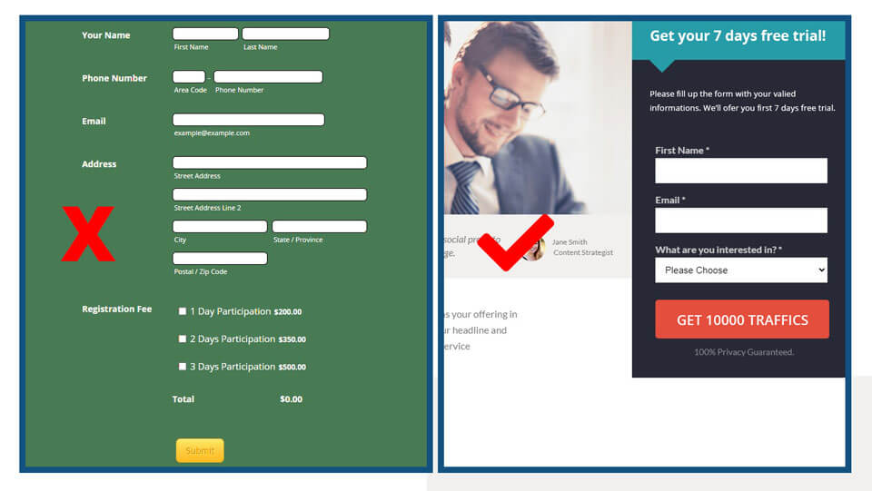
It’s important to optimize your form fields, as the last thing you want is a page that doesn’t lead to leads. To get more signups make sure that you are not asking for too much information in your forms and that the labels are clear and concise. Remember: only ask for what you need; anything else will be unnecessary clutter.
Some experts suggest that the basic information you should be asking for is: name, email address, and phone number. If you want to collect more data on your leads then it’s good practice to give them a reason to do so, such as a coupon or bonus. You may also consider asking for their business type, location, and any specific needs they might have.
You can make a trick, ask for further information in the next steps. Like after submitting a form they might redirect to the purchase page or next steps page where you can ask for more information if required. After submitting the first steps they are already engaged so they are ready to fill up more!
Make your landing page more personal
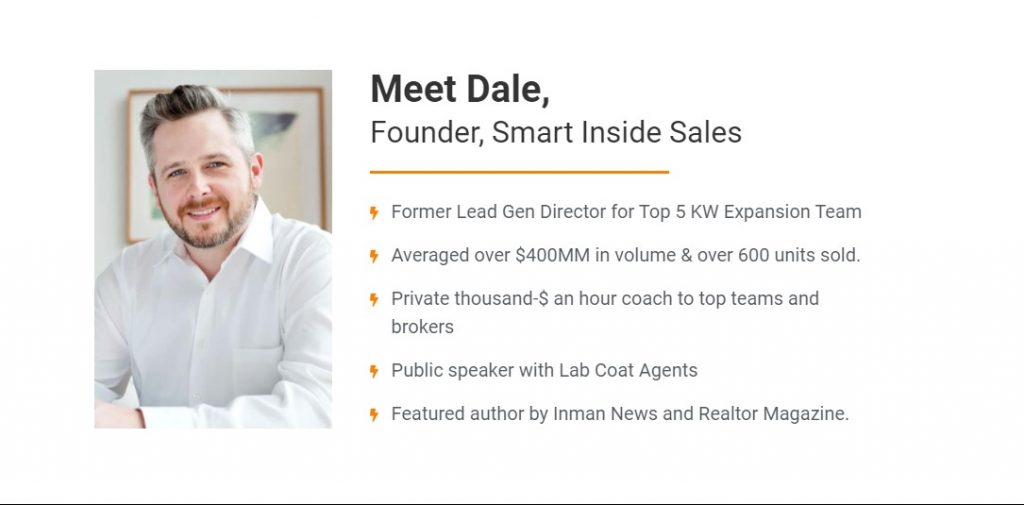
Something as simple as including a picture of the company’s owner can really make your landing page more personal and compelling to visitors. By doing this, you’re telling them that they are speaking directly with the person in charge instead of some faceless entity – which automatically gives people peace of mind about their decision-making process because it feels like there is someone behind who actually cares what happens on both ends.
Include an Explainer Videos
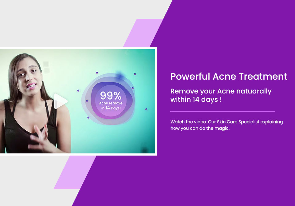
Explainer videos are a great way to provide visitors with an overview of your company, what you do, and why they should choose you over all the other options in their field. This is especially important if there are so many companies out there that offer something similar – which can make it difficult for customers who aren’t sure about how different each one is from another! The video will help them gain insight into this question by providing valuable information in just two minutes or less.
Include explanatory videos on landing pages; keep content short but informative for an easy decision-making process (less than two minutes). You can upload video on YouTube, Vimeo, or Upload to your server then embed it.
Display Trust Badges & Guarantees
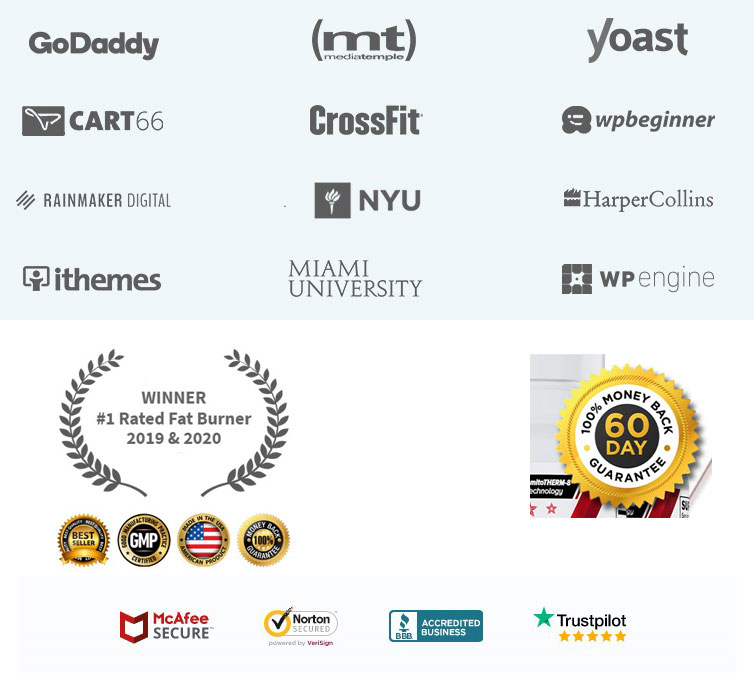
If you want to build a reputation for your company then put some trust badges or guarantees on the landing page. These are little things that make visitors feel confident about their decision and will ultimately lead them to convert because they know they can count on what you say – which is especially important in today’s world when people don’t like being misled, tricked, or scammed by companies who promise one thing but deliver another!
Display trust badges (or any other guarantee) so customers become more confident with the purchase process; use high-quality photos of your products if it makes sense
Offer incentives to motivate prospects to convert
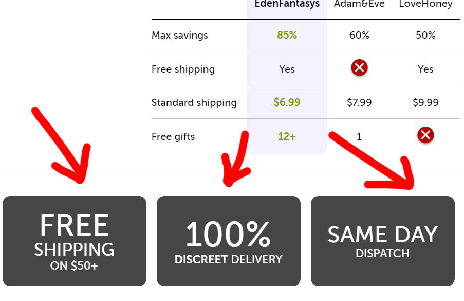
Offering incentives is a great way to motivate prospects so that they convert and become customers. For example, you can offer discounts or free shipping if they buy now instead of waiting for prices to go down – which will push them into making the purchase quicker because it’s like getting something extra in their cart without paying any additional cost!
Incentives are more effective than just relying on your landing page copy alone because people often don’t read all the text before committing (especially when there’s a lot of content) and by having an incentive right at the top, chances are good that prospective buyers will commit faster while still reading what you have written about your company and its mission.
Offer attractive discounts such as “buy one get one free” or “free shipping on orders over $100” so that customers are more likely to convert.
Create a sense of urgency
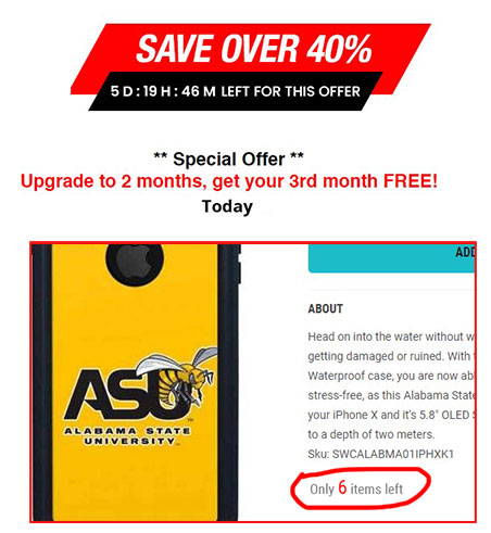
Create a sense of urgency by offering limited-time discounts and promotions on select items. You can do this by using phrases such as “while supplies last” or “hurry, only one left!” to give them the idea that they need to act now if they want enough time for their purchase to arrive before it comes back in stock – which is great because people are more likely buy things when there’s an expiration date on it
This also works well because many consumers have been conditioned over decades of marketing campaigns from grocery stores and other types of retail outlets that offer sales at certain times during the year; shoppers know what days these deals will be up so they’re less likely to shop around looking for better prices if you mention something like this. This is all about focusing on what your customers want and making it easy for them to find the information they’re looking for!
Include a photo of people using your product or service
A great way to convert more prospects – including those who are less likely to sign up – is by adding an image of people actually using your products or services; this gives consumers a better idea of how much you care about providing quality items that will offer them tremendous value in their everyday lives, which can really help boost conversions rates as well.
Images such as these also work because many shoppers today have become accustomed to seeing images accompanying content when browsing online stores rather than just reading prose, so giving them something visual might cut down on the friction between visitors and your site.
Include Social Media Icons
You should include social media icons for your company’s profiles in order to give visitors the ability to share your landing page content with their networks – which can be a great way to gain new followers who might not have otherwise found out about you!
Social media websites make it easy for people to find and follow brands, organizations, politicians, public figures, etc., all across the world; they’re also an excellent tool when trying to bolster awareness of products or services because any time there is mention of them online then this increases exposure. These sites offer companies opportunities for advertising campaigns and promotions by using tools such as Facebook ads, Twitter promotions, or LinkedIn marketing.
Include an FAQ Section
Include an FAQ section on landing pages; save time answering customer questions by including them here before they ask (if it makes sense for your company).
This is great because many people will skip past content altogether if they don’t see anything related to their question – even if it’s just below or above where they’re looking at! This means you might lose out on potential leads because someone else answered their question while you were busy trying not to get bogged down with repetitive inquiries.
An FAQ section is great for giving consumers answers before they even have time to ask questions. It’s also helpful because it saves you from having to answer the same questions over and over again, which can be exhausting. If you have a lot of customers asking about what size your shirt comes in then put that as one of the FAQs!
Use a live chat module
So many companies are using live chat on their landing pages now because it helps turn more leads into sales. A lot of people don’t realize this, but landing page conversion rates can increase by as much as 25% when a messaging tool is used to give visitors the ability to speak with support members instead of having to go through (what they perceive as) an overly complicated process that involves typing their questions or concerns into a comment box.
A live chat agent might also be able to answer a consumer’s question in real-time; if you have knowledgeable support agents running these modules then they’ll be able to provide accurate answers while the visitor is still browsing your site. This way, there’s no need for them to leave and research what you’re offering – which can increase conversions because they’ll be more likely to buy from you!
Test Multiple versions of landing page
Test out multiple landing page layouts before launching the final version; look at how results for each stack up against one another in terms of conversion rates. While it’s common knowledge that there is no such thing as a ‘correct’ layout, you should test to see what kind of impact each has on performance metrics because some will tend to convert more effectively than others. This can vary based on your industry and customer base – so be sure to do plenty of A/B testing!
This might take some time, but if you’re dedicated and willing then try testing different things like the size, color scheme, design elements (i.e., images or not), etc.; it’ll take a little bit of time but running a few tests can be extremely beneficial!
Conclusion of Increase Conversion Rates
It’s not enough to have a great product. You need an easy-to-use website and landing page that converts visitors into leads or customers at the highest rate possible. By following these tips, your business can easily improve its lead generation efforts.
The landing page has become a very important part of Internet marketing, both for SEO and PPC campaigns. It is where people will make the decision to move forward or not with further interactions in a variety of ways (i.e., call you, contact you via email, sign up for special offers) so it needs to be set up properly to enhance your chances of success!
Be sure to always test and experiment with new strategies because what works today may not necessarily work tomorrow or even next week. Whatever tactics you use should align with your industry and target audience – only then will they prove fruitful and help drive leads towards conversions!
If you need technical support, I am here to help you. What are we waiting for?! Let’s queue up a chat. Contact now

